At Vivid Image, we strive to create websites that are usable for as many people on as many devices as possible. We offer an option for clients who prioritize accessibility for following the standards of WCAG 2.2 Level AA guidelines. For clients who select this option, we conduct specialized testing and implement additional features to create a more inclusive digital experience. This guide outlines essential practices for crafting more accessible web pages and posts.
WCAG 2.2 Level AA
WCAG 2.2 Level AA is a widely recognized standard for web accessibility. It outlines specific criteria for making digital content more accessible to all users, including those with disabilities.
Why Accessibility Matters
Accessibility means removing common barriers for users with disabilities, ensuring everyone can access and interact with your website. Focusing on the fundamentals offers significant benefits:
- Reaching a Wider Audience: Even small changes make your site accessible to more people, including those with common impairments.
- Improving Overall Usability: Good accessibility often enhances usability for all users.
- Creating a Solid Foundation: Mastering the basics is the crucial first step toward comprehensive accessibility.
- Demonstrating Commitment: Showing you care about accessibility starts with these core principles.
Core Accessibility Practices
Here’s a breakdown of essential accessibility practices and why they matter:
- High-Contrast Color Combinations: Enhances readability, especially for users with low vision or color blindness.
- Readable Text Size: Ensures content is readable without zooming, benefiting users with visual impairments.
- Descriptive Alt Text for Images: Provides context for screen reader users and when images fail to load.
- Logical Heading Structure: Creates clear navigation for screen readers and all users.
- Keyboard Navigation: Makes your website inclusive for users with mobility impairments.
- No Flashing Content: Prevents seizures in users with photosensitive epilepsy.
- User-Controlled Media Playback: Avoids disruptive auto-play for audio and video.
- Tables for Data Only: Maintains logical content structure for screen readers.
- Control Over Time-Limited Content: Provide control and limit use of time-based content.
Provide Support
- Accessibility Statement: An Accessibility Statement provides information about your website’s accessibility and contact information for reporting issues. A direct link to that statement should be listed in the footer.
Heading Structure is Key
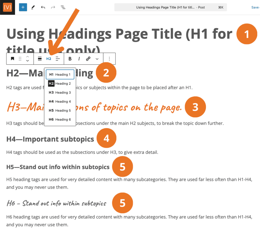
The main thing to remember about headings when creating a page or post is to follow the reading order with the use of Heading tags and to use them consistently throughout the website. Make sure all headings are descriptive and tell the reader what the paragraph or topic is about. Screen readers can read the page via headings only so it is important that headings are used in the correct way.

Why Headings Matter
- Headings help everyone understand the structure of your content.
- They are especially important for people using screen readers, as they allow them to navigate the page easily.
Which Heading Tags to Use
- Page Title (H1): Use only one H1 per page. This is the main title of the page.
- Section Titles (H2 – H6):
- Hierarchical Structure: Use H2, H3, and further heading levels (H4-H6 as needed) to organize sections and sub-sections, maintaining a logical flow. (Example: Place an H2 under H1, H3 under H2, and so on).
Accessible Forms
- Clear Labels: Ensure every form field has a visible, descriptive label.
- Instructions for Required Fields: Clearly indicate which fields are required.
- Keyboard Accessibility: Ensure all form fields and buttons are reachable and usable with a keyboard alone.
Why This Is Important: Accessible forms ensure that users with disabilities, including those using screen readers or those unable to use a mouse, can complete forms without barriers. Clear labels and error messages enhance the overall user experience and prevent frustration.
Descriptive Links
- Avoid generic link text like “Click here” or “Read more.”
- Provide context within the link itself.
- Example: Instead of: “Click here to learn more.” use “Learn more about our company history.”
Meaningful Buttons
- Buttons should clearly indicate their action.
- Example: Use “Download Event Brochure (pdf)” instead of “View Doc.” This tells the user that they are linking to a downloadable file.

Masking URLs
- Use descriptive link text for email addresses, such as “Contact Support,”‘ rather than displaying the actual email addresses.
- Example: Instead of “[email protected]”, use “Email Support”.
- Avoid displaying long, complicated URLs directly as link text. Instead, embed the URL behind descriptive text or a button. This improves readability and prevents screen readers from reciting lengthy, unintelligible URLs.
- Example: Instead of “Visit our site at https://www.example.com/long/complicated/page/path” use “Visit our website” (with the URL embedded).
Image Accessibility Recommendations
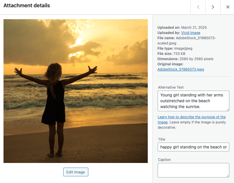
Images do not always appear on a website for all users. When images are not available, it is important to provide descriptive alt text that conveys the image’s purpose and content so that the user can still understand what the image is about.
- Alt Text: Avoid using generic file names like “IMG_1234”. Instead, use “Young girl standing with her arms outstretched on the beach watching the sunrise.”
- Images as Links:
- If an image serves as a link, the alt text should describe the link destination (e.g., “Vivid Image home page” instead of just “Vivid Image”).
- Decorative Images:
- If the image does not add any value to the page and is just for decoration, leave the alt text blank.
- Avoid Text in Images:
- If text is necessary in an image, ensure it is also provided in the page content or alt text.

Clear Language and Navigation
Clear and accessible language is essential for all aspects of your website. Just as visual content must be clear, your written content should be easy to understand for all users. This includes both the main content of your pages and your menu navigation.
- Use simple, straightforward language. Aim for a 9th-grade reading level.
- Keep line lengths reasonable.
- Limit the use of ALL CAPS, reserving it for headlines.
- Keep menu items concise, clear, and descriptive. Page titles and menu labels should be easily understood.
- Avoid jargon and overly complex sentences, especially in navigation. Use plain language that is easy to understand. For example, use “About Us” instead of “Who We Are” to ensure clarity.
Keeping Your Site Accessible
The world of web accessibility is constantly evolving, with new standards and best practices emerging regularly. To keep your website accessible and user-friendly, it’s crucial to implement these ongoing strategies:
- Regular Accessibility Audits: At least once per year.
- Ongoing Education: Training on how to maintain accessibility standards.
- Stay Up-to-Date: As accessibility standards and best practices evolve.
Ready to Learn More?
Ready to make your website more accessible and inclusive? Schedule an accessibility consultation with our experts to discover actionable steps you can take today.
