Why Your Design Looks Different on Every Screen
Have you ever opened a design mockup on a laptop, then opened it again on an office desktop, and thought: “Wait, why does the text look smaller here?” or “Why is there so much empty space on the sides now?”
It is a common concern to wonder, “Is it supposed to look like this?” The short answer is: Probably not. A computer screen is actually a “lens” that can stretch or shrink a design. To see the “truth” of a project, it helps to understand how screens work and how to set them up correctly.
1. The “Big Screen” Misconception
It is natural to assume that a bigger monitor shows a “bigger” version of a website. However, physical size (inches) and digital size (pixels) are two different things.
Think of it like looking through a window in a house. If the window is small, you only see the tree in the front yard. If the window is massive, you see the tree, the fence, and the neighbor’s house. The tree itself hasn’t changed size; you simply have a wider frame to see more of the landscape. On a large monitor, a website doesn’t necessarily get “bigger” it just has more room to show extra space on the sides.
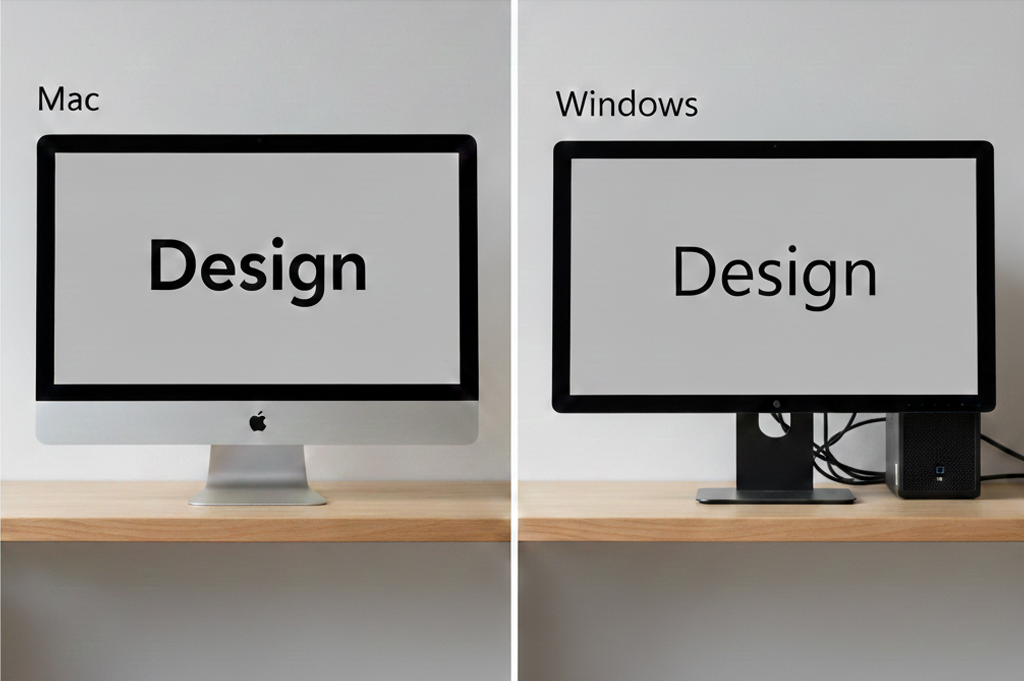
2. Browsers Are Like Different Lenses
Websites aren’t static pictures; they are sets of instructions. When a link is opened in Chrome, Safari, or Microsoft Edge, those browsers “read” the instructions and build the page.
Because every browser (and every computer type, like Mac vs. PC) “reads” a little differently, minor shifts occur. A font might look slightly thicker on a MacBook or sharper on a Windows computer. These aren’t errors; they are simply the computer’s unique “personality” coming through.
3. Ensuring Accuracy in MarkUp.io
Whether reviewing a live website or an uploaded PDF, MarkUp.io acts as a container for the work. It is important to remember that MarkUp is a web-based tool, not a dedicated PDF reader like Adobe Acrobat.
Even with a fixed document, the software tries to “help” by scaling the file to fit the browser window. If the window is stretched wide, MarkUp stretches the PDF to match. This can result in a loss of clarity or a “false” sense of how large the text actually is. To see the document with the precision of a printed page, the browser settings must be calibrated.
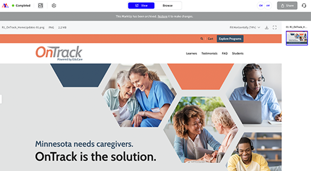
Zoomed in at 74%
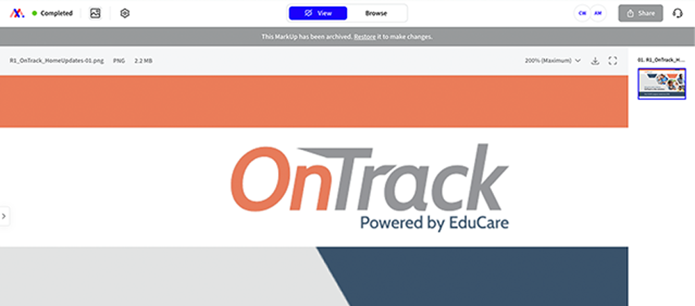
Zoomed in at 200%
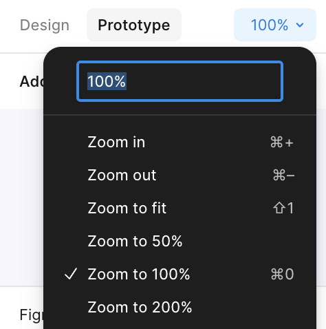
4. The “Rubber Band” Effect (Figma & MarkUp)
Tools like Figma and MarkUp.io try to be “helpful” by automatically stretching a design to fill your entire screen. This setting is often called “Fit to Width” or “Zoom to Fit.”
If you are using a large monitor, the software pulls the design like a rubber band until the buttons and text look unnaturally huge. This is usually why a design might feel “clunky” or “oversized” during a review. To see the design as it’s intended, you need to switch your view to Actual Size (100%).
5. Designing for Thousands of Screens at Once
A common question is whether a design can be “locked” so it looks identical on every screen. In the modern digital world, designers actually have no control over the size or brand of the monitor a customer uses.
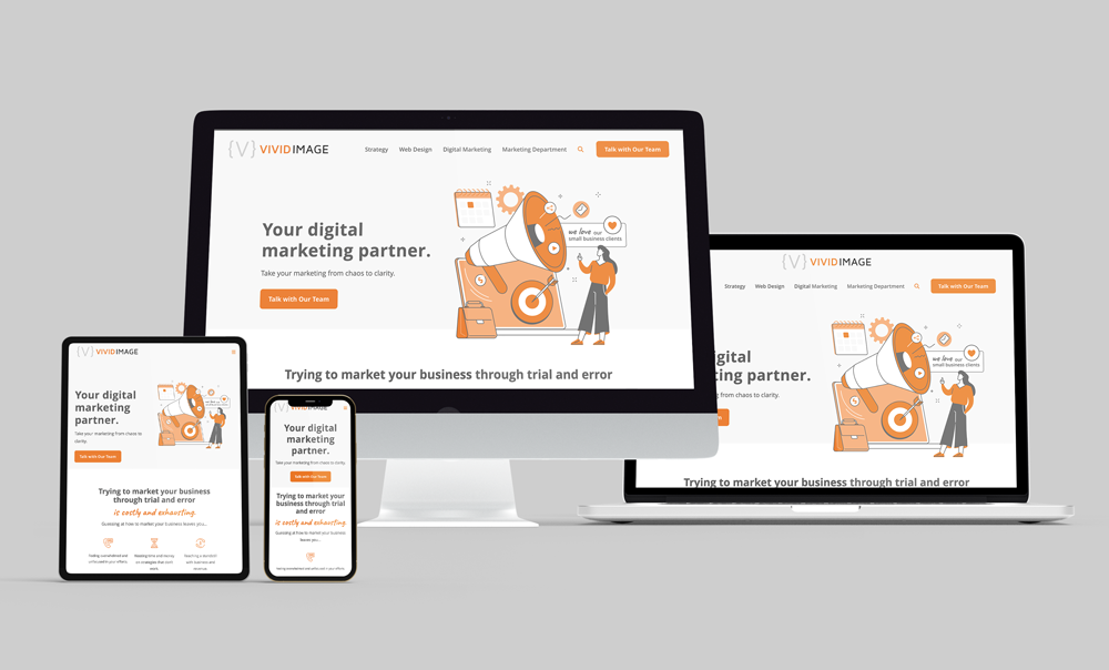
Because of this, designs are built to be Responsive. This means the website is smart enough to move and shrink itself to fit the user’s device. Instead of forcing the design to stay still, it is taught to flow. This ensures that whether a customer is on a giant TV or a tiny phone, the site remains easy to use.
How to See the “True” Design
Since every screen is different, use this 4-Step Calibration to make sure the monitor is providing an accurate view before leaving feedback:
- Use the Right Device: Always review “Desktop” links on a computer and “Mobile” links on a phone. Viewing a desktop site on a phone will always look distorted.
- Reset Your Zoom: Hold Cmd (or Ctrl) and press 0. This ensures the browser isn’t accidentally zoomed in or out, which can make things look blurry.
- Select “Actual Size”: In tools like Figma, go to the top-right menu and change the view from “Fit” to “Actual Size.” If the design feels “blown up” on a small laptop, try zooming out to 70% or 80% to find the natural proportions.
Focus on Proportions: Instead of asking, “Is this font too big?” ask, “Is this the first thing the eye should see?”The goal is to ensure the message is clear, no matter what “lens” is being used to view it.
Ready for a Modern Digital Experience?
Rebuild your website to take advantage of cutting-edge features, seamless flexibility, and airtight security designed to drive customer activity. Let’s build a site that looks perfect on every screen.