Updated: 01/14/2026
Your brand is more than a logo.
It’s how the world recognizes and remembers your business.
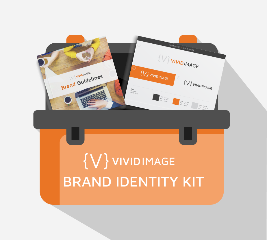
Consistent branding not only helps make your company look professional and intentional with your marketing, it also helps build trust and recognition with your audience. A brand identity kit, or brand kit, brings all the visual pieces of your brand together into one place so anyone, internal team members or outside vendors, can access and understand how to use them.
What is a Brand Identity Kit?
A brand identity kit is a centrally located, organized folder of all the digital assets that build your brand visually. It can include logo files, font files (if your license provides enough seats), color palettes, secondary visual elements such as patterns and textures, and any other design elements used regularly in digital and print communication. Having all these pieces in one place and accessible ensures that you stay consistent with your branding.
A Well Organized Folder
- Keeps your brand consistent
- Saves your marketing team(s) time looking for elements
- Helps protect your brand’s visual integrity
- Helps makes onboarding new team members easy
Core Elements of a Brand Identity Kit
These are the core elements that we recommend you add to your brand identity kit.
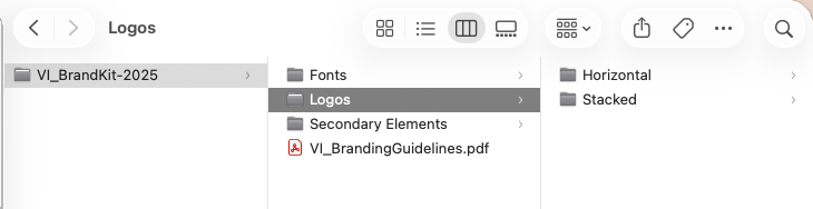
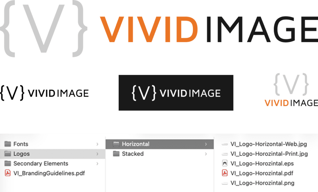
Logo and It’s Variations
Different platforms and uses can require different logo files or orientations. Having them readily available allows for a quicker turnaround from your marketing team and vendors. Below are the file types we recommend you keep on hand:
- Primary logo
- Alternate layouts such as horizontal and vertical/stacked.
- Color options such as full color, black and white, and reverse white.
- Different file formats for each version (If we created your logo, these are the files we provided you!)
- Vector (.eps or .ai): These files are scalable, allowing the logo to be resized for various uses without losing quality.
- JPGs for both print and web
- PNG with transparent background
- Print-ready PDF
Bonus tip: Having more than one orientation (horizontal and vertical) and color options can be helpful, as a logo will be placed on multiple platforms. For instance, a logo version in a square format comes in handy when uploading to Facebook or Twitter as a profile picture. This ensures your logo won’t be cut off anywhere and made unrecognizable.
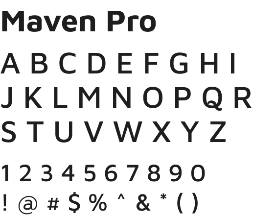
Fonts
Including font files or links to download ensures that everyone is using the typeface you intend. This includes fonts used in your logo and in places such as body copy or headings, since these are not always the same. This helps prevent guesswork and substitutions that create inconsistencies.
A couple of things to note with fonts:
- Fonts purchased or downloaded for free typically have a seat count attached to them. Pay attention to the licensing and number of devices your fonts can be added to.
- Check the licensing on free fonts. Sometimes they are only okay for personal use!
- There are Window and Mac specific fonts. If you are using these, it can be good to note a substitute for the opposite operating system.
Secondary Elements
Secondary elements are any supporting visuals that consistently appear across your marketing. These elements add depth and personality to a brand. They can help create recognition, even if your logo isn’t present. Like your logos, make sure to have high-resolution files of them on hand, and if possible, in different file types. Examples include:
- Icons
- Photos or illustrations
- Patterns and textures
- Taglines or one-liners

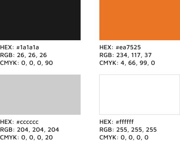
Color Palette
Color is a huge visual element in many brands. Colors can invoke feelings and emotions, and should be unified throughout your marketing. Including a document listing all the colors is a must.
- Hex – A set of numbers and letters that most software has an input for when choosing colors.
- RGB – Used on digital displays.
- CMYK – Ink colors used for printing.
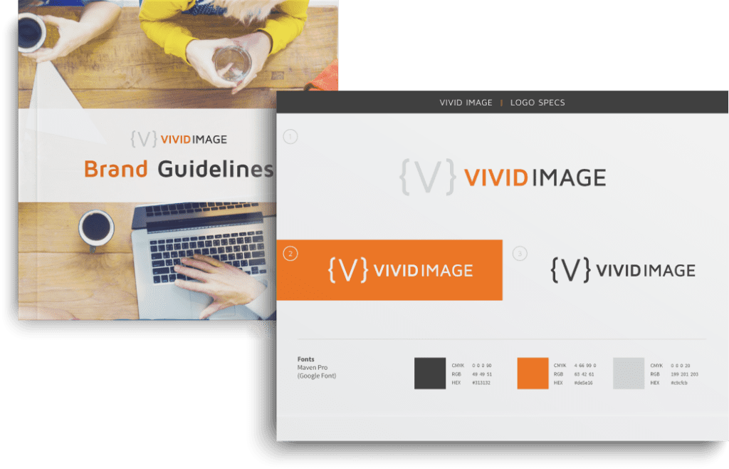
Brand Usage Guidelines
A usage guideline can be as detailed as you’d like it to be. It can be a one-page sheet that simply explains the fonts and colors of your branding to a multi-page document explaining all the dos and don’ts of your brand.
These larger guidelines can even include the voice of your company and consistent messaging such as taglines or one-liners. The more detailed you are, the more consistent your brand will be as you’ll have a stronger set of guidelines for your team to follow.
Frequently Asked Questions
A logo is actually just one part of your brand! An identity kit includes all the bits and pieces that defines how you brand looks and feels wherever it appears. A whole identity kit ensures consistency beyond just your logo.
Yes! Even small businesses benefit from consistent branding. You may do most of your marketing yourself, but if you have an instance where you need to outsource something, like a sign for the front of your building, you have a kit you can send your vendor to ensure they understand your brand.
The Brand Identity Kit is the collection of all the assets used in your branding. The Brand Guidelines is an explanation on how to use those assets together. As you grow, you may find that one or both of these grow with you.
We recommend having your identity kit in a central location, accessible to those who may need to use it. Google Drive or Dropbox can be great places to store it.
It is important for your brand to be consistent and recognizable.
Every business owner wants their product to have a home in today’s ever growing marketplace. Having a solid look and feel can help aid in that. Doing simple things like creating guidelines and identity kits is a great way to start. If you need help with any of this or have questions, give us a call.