Mastering Typography
The Ultimate Guide to Design Fonts
Although many people think of colors or pictures first, fonts are the unsung heroes of design. Every time you open an email, scroll on social media, or read a highway sign, a designer has specifically chosen a font to influence how you feel and how fast you can process information.
Understanding the difference between font types is the first step toward creating a professional brand.
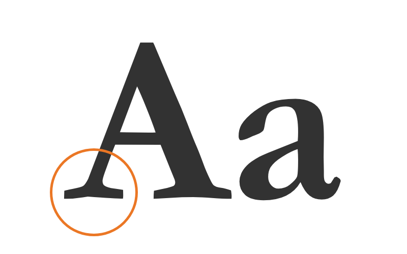
The Professional Standard: Serif Fonts
Serif fonts are characterized by the small lines (or “feet”) at the end of each letter stroke. These fonts are often described as professional, authoritative, and traditional.
Best For: Headlines, printed books, and brands that want to feel “established.”
Examples: Times New Roman, Playfair Display, Georgia.
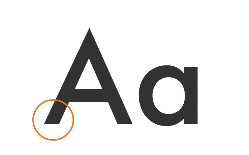
The Modern Choice: Sans-Serif Fonts
“Sans” simply means “without.” These fonts lack the decorative feet of serifs, resulting in a clean, modern look that is incredibly easy to read on digital screens. Because pixels can sometimes blur fine details, sans-serifs are the gold standard for web accessibility.
Best For: Body copy on websites, mobile apps, and “minimalist” branding.
Pro Tip: Mix a Serif header with a Sans-Serif body copy to create an instant visual hierarchy.
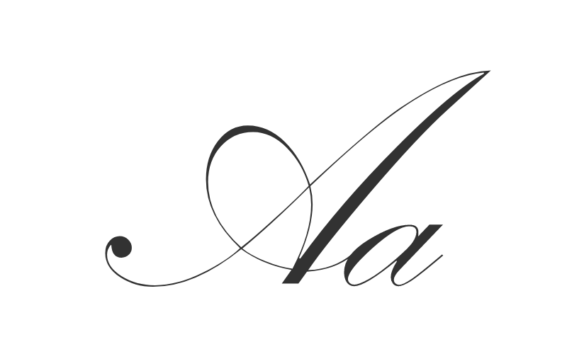
The Attention-Grabber: Display Fonts
Display (or decorative) fonts are the “wild cards” of design. They come in various shapes—from script to heavy block lettering—and are meant to grab interest immediately.
Rule of Thumb: Use these sparingly. They are perfect for logos or H1 headers, but they become illegible when used for long paragraphs.
Where Can I Find Fonts to Use?
Now that you know the basic types of fonts, where should you find the perfect one for your next project? Selecting a high-quality source is essential not just for design, but for site speed and legal safety.
Our Top Recommendation: Google Fonts
Our go-to for free-to-use fonts—for both commercial and non-commercial projects—is Google Fonts. It is the gold standard for a few reasons:
- Open Source: You can download and install them on your computer or embed them on your website without worrying about a “per-click” fee.
- Web Optimized: These fonts are designed to load quickly, which is a major “trust signal” for search engines.
- Vast Library: With over 1,500 font families, you are guaranteed to find a pairing that works.
Fonts in Your Brand
It’s also important to keep in mind your company branding. Much like the logo you use or the colors on your site, you want to make sure that you keep your fonts consistent. Consistency is key when it comes to being recognizable with your clients, and that includes making sure that you use the same fonts, or combination of fonts, within your designs.
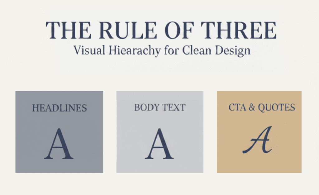
The “Rule of Three” for Visual Hierarchy
To maintain a clear visual hierarchy and avoid “visual clutter,” we recommend using only 2 to 3 fonts maximum. This ensures your message doesn’t get lost in the design.
- Primary Font: Used for your main headers (H1, H2). This font should have the most “personality” and reflect your brand’s core identity.
- Secondary Font: Used for your body text. This font’s #1 job is to be easy to read. Usually, a clean Sans-Serif works best here for digital screens.
- Accent Font: Optional. Use this sparingly for buttons, quotes, or specific calls to action (CTAs) where you need to draw the eye immediately.
Expert Tip: If you use a very decorative Primary font, keep your Secondary font very “quiet” and simple. This balance creates a professional, “magazine-style” look that AI and users both appreciate.
Frequently Asked Questions
A typeface is the underlying design (the “style” like Roboto). A font is the specific file or variation you use (like Roboto Bold, Size 12).
While some variation is okay, your primary “Brand Fonts” should be as consistent as possible across all platforms to ensure a seamless experience for your clients.
This is often due to “system fonts” or slow loading times. Using a service like Google Fonts ensures that the font is delivered consistently to any device the user is using.
Ready to Define Your Brand’s Voice?
Choosing the right fonts is more than just a design preference—it’s a strategic decision that affects how your customers perceive your authority and trust. Whether you are building a new site or refreshing an existing brand, getting your typography right is a foundational step in your digital success.