Color is a powerful tool in graphic design. The psychology of color plays a crucial role, yet many people don’t realize the importance of color and why it’s necessary to carefully consider what colors represent a company. Different colors evoke emotional responses, allow companies to connect with their audiences, and create a cohesive brand color palette that enhances recognition and trust.
Emotional Responses to Colors
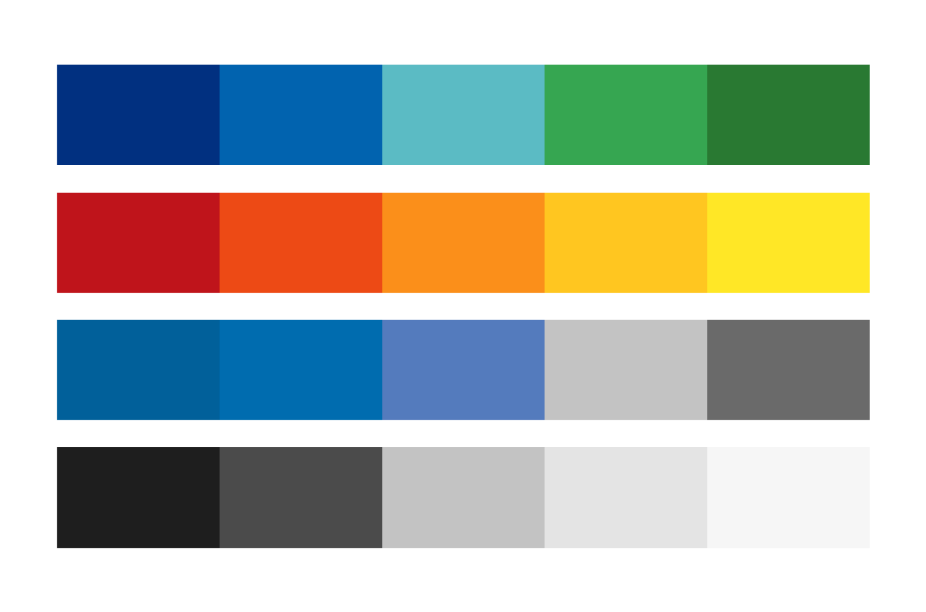
Color can evoke emotional responses. Here are some examples of common colors and the emotions they typically represent.
- Red: This bold and warm color evokes passion, strong emotions, excitement, and urgency. It is often used to grab attention and draw people in.
- Blue: This cool color represents a calm and inviting atmosphere. It also shows professionalism and trust. This color is often used to establish credibility.
- Yellow: A warm and bright color representing optimism, happiness, and energy. It is used to show excitement.
- Green: This is a cool-toned color that shows growth and health and is associated with being natural. It is another relaxing and calm color.
- Orange: This is a friendly and warm color. It represents health, enthusiasm, and confidence. This high-energy color blends the emotions from red and yellow, bringing the best of each.
- Purple: A color representing creativity, imagination, and wonder. It is often seen as a magical and fun color.
- Black and White: These colors typically represent sophistication, luxury, cleanliness, and simplicity. Although essentially every design will use black and white somewhere, on their own, they lean into the simple and clean aesthetic.

Industry-Specific Color Considerations
Now that we can see how different colors produce emotions, we can look at how various industries use them. You may have noticed that many companies and their competitors have similar colors and branding. This is because we tend to associate certain industries with specific colors. Here are some examples of industries and the colors we associate them with.
- Healthcare & Wellness: Blues and greens tend to be calm, trusting, and professional colors, which is why hospitals, pharmacies, and wellness companies often use them in their branding.
- Food & Restaurant: Bright and bold colors are best when trying to grab people’s attention. These colors often include red and yellow, which can increase appetite and energy.
- Technology & Finance: Many of these companies will use blue as their primary color since it represents trustworthiness and security.
- Luxury & High-End Brands: High-end brands will often use black and white to look sophisticated yet simple enough that they aren’t messy. Often, a gold or silver color could be associated with these brands to add a nice accent color and stand out even more.
Creating a Cohesive Brand
Colors clearly impact our emotions and how we interact with companies. When considering colors for a brand, we must look at the psychological response we’ll be creating. You want your brand to use colors that positively represent your company. The colors should also look good together while conveying the right emotions you want to display. By carefully thinking about these things, you will help your branding stick out and provide the best experience for your clients.
Questions about Your Brand Identity?
We’re here to help! Reach out and we’ll answer your questions and help you build a strong brand identity.