What is Whitespace?
Whitespace, also known as negative space, is a design term that describes an empty area without design elements. This would include things like pictures, text, icons, etc. Despite the name being commonly referred to as white space, this empty area can actually be any color! Whitespace can be found in many forms of design, including websites, social media posts, print pieces, and more.
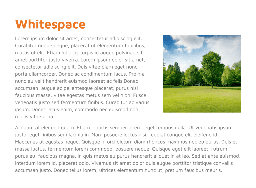
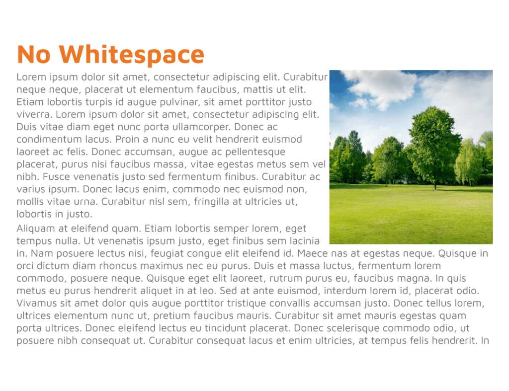
Below are two examples of sections with text and an image. One utilizes white space, and the other does not. With just a quick glance, you can probably tell that one looks better and is easier to digest, while the other is crowded. Adding just a little bit of spacing between elements can completely elevate our design.


Benefits of Whitespace
Whitespace can make our designs look better, but it has more benefits than just being aesthetically pleasing. It can organize your content, ultimately making it easier to comprehend and follow up.
1. Organize content in an easy-to-understand format
The first benefit of whitespace is that it can separate elements into groups and allow the users (people viewing your design) to gather information more easily. When the design is split into different groups, the content is easier to digest since it is divided into smaller sections.
2. Make it easier to read
When we add spacing between elements like text, it’s easier to read. With enough spacing between text and other elements, it becomes much easier to read the text. When people can read the text easily, they can also comprehend it much faster.
3. Highlight important elements
Another benefit is that we can make it easier to call out elements, like your call-to-action. This is the action that you want a user to take after reading through your content. We want CTAs to be super easy to find, and using whitespace to set this apart is a great way to make sure the users see them!
