If you have watched your Google Analytics in the past few years, you may be seeing the trend of mobile users on the rise. In most cases, the majority of website traffic now comes from mobile devices. Because mobile traffic has, and continues to increase, the way we approach website design also changes.
Over half of website traffic now comes from mobile devices!
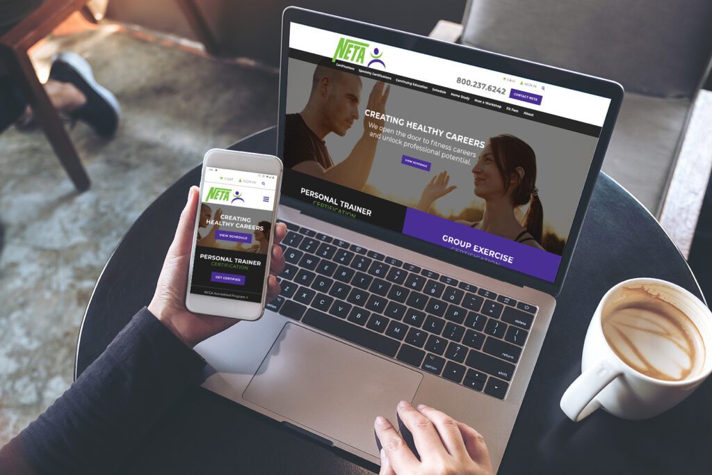
When you compare the size of your cell phone (average screen size about 6”) to a 27” iMac or PC, the screen size is considerably different. And when a huge user base is looking at your website via that 6” screen, the amount of real estate you have is small. This means you need to get your main point across quickly and efficiently.
The Mobile First Design Process
The mobile first design process is just that – basing your website off of what it looks like on a mobile device first and foremost. This includes content, imagery, and functionality.
Mobile users have different needs than somebody sitting at a laptop. They need to have the website load quickly over wifi and cell network. They are not going to want to “pinch and zoom” to try to read content. Make sure you have the action you’d like the user to take highly visible (without a lot of scrolling) and easy to understand.
Content
Content is one of the most important parts of any website, whether it’s viewed on a phone or desktop. It is good practice for any content on your site to be highly relevant and highly valuable. With the smaller real estate, it is important to give mobile users exactly what they need. It also makes Google happy, especially when searches come in organically to your website. It is a good plan to have a strategy in place to have your website content well-organized and to have clear action items you want somebody to take.
Graphic Design
Even though the space may be small, that doesn’t mean your design pieces can’t be eye catching and exciting. It is important to keep image and graphic sizes in mind so they download quickly. Also consider font and button sizes as text needs to be read without having to “pinch and zoom” and buttons easily clickable with a finger or stylus.
Make Communication Simple
It is best practice to make phone numbers clickable to give the user the option to call you straight from the website. It could also mean giving your users the option to text or social media message you.
Conversion Rates Go Up
User experience and quality directly relates to your website’s performance. Websites that are optimized for mobile screens have a greater chance for conversions and lead generation. Being mobile optimized can also help with your Google rankings as well. In 2018, Google rolled out Mobile-First Indexing on a broad scale. This means they use the mobile version of your web pages for indexing and ranking. If your site doesn’t provide a good experience for a mobile user, Google can (and likely will) choose to show your site less often in organic search results, resulting in lost traffic.
Having a mobile first website also boosts your company’s image that you are progressive, modern, and innovative. This is in combination with being able to help solve your customers’ problems quickly, and builds trust in your user base.
If you’re concerned about your users’ mobile experience on your website, let’s talk! Call or contact us today.