Capturing and holding a user’s attention is a key challenge in design.
Whether designing a website or a print piece with lots of information, visual hierarchy helps direct focus to the most important elements. By arranging text, images, and other design elements, you can make users engage with your content in a meaningful way.
What is Visual Hierarchy?
To start off, let’s define visual hierarchy. It is the arrangement of elements to create a natural flow of information. Designers will use size, color, spacing, and typography to guide a user’s attention and make sure they understand the key message.
Design Methods to Guide Users
Size and Scale
Although this may seem obvious, the bigger an element is, the more attention it will grab. Designers use large elements to call out important things and draw attention to them. This is often why headlines are bigger than regular text, so that users who are skimming content can still grab the important information a section is about. Although the smaller text is important, too, it’s used to support and explain the large elements.
Color and Contrast
Bold, high-contrast colors help grab attention. For example, think about a stop sign. If it were blue, it would blend into the sky and natural background, and many people would drive right through it. However, stop signs are big, bright, and red, easily capturing people’s attention and forcing them to focus on what the sign says. Just like a stop sign grabs your attention by sticking out from its surroundings, you want the critical parts of your design to stand out.

Typography
Typography is the text that appears in your design. You want the text to have a visual hierarchy where the bold headlines create a clear visual order that the user can follow. Having headlines throughout your design will make it easier for users to digest and understand, even if they’re just skimming through it.
Whitespace
Another essential element in design is whitespace. If you haven’t heard of this concept before, it is when a design has space without anything in it. Yes, parts of your design should be completely empty! This allows the content to breathe and have proper spacing. This ultimately makes it easier to scan and understand. Designs without whitespace are cluttered and very hard for users to navigate through.
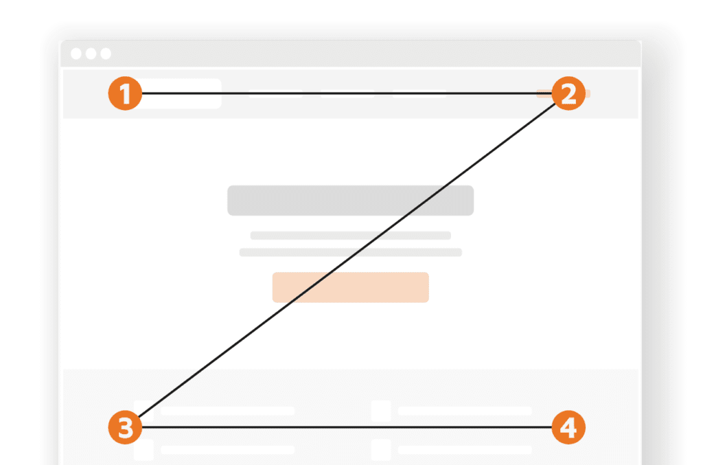
Layout
One common website pattern you may have heard of or seen before is the “Z-Pattern” layout. When a user scans a website, they will do so in a Z-pattern, starting in the upper left corner, moving their eyes over to the upper right corner, then drifting down and across the page to the bottom left, and ending up in the bottom right. This creates the “Z”. Knowing this, it’s wise to make sure that any important information on your website (your logo, main message/what you do, and a call to action) are along these pattern lines!
Images and Graphics
Including images and graphics, such as icons, in your design is a great way to break up heavy text sections and grab user attention. Icons are typically used to call out key ideas that otherwise can get lost in text. Images can support your text while also giving users a break from reading so much. You want to make sure to choose images that are relevant to your content and look good in the design.
Enhancing User Experience Through Visual Hierarchy
A well-executed visual hierarchy simplifies designs, ensuring that users can quickly find and absorb important information. By thoughtfully balancing text, images, and spacing, designers can create visually appealing layouts. This strategic approach enhances user engagement, improves readability, and makes the overall experience more effective and impactful.
Ready to Create Designs That Capture Attention and Guide Your Audience Effectively?
Contact us today to discuss how our graphic design services can help you implement these visual hierarchy principles in your next blog post, billboard, landing page, or ad!