Let’s start with a simple question. Have you ever shared a post on Facebook or LinkedIn, added a link, and then wondered why it didn’t get much traction? The good news is, you’re not alone. And more importantly, it’s not necessarily your content. Something Has Shifted Over the past few years, platforms like Facebook and LinkedIn have been getting smarter about what they show to users and Continue Reading
Blog
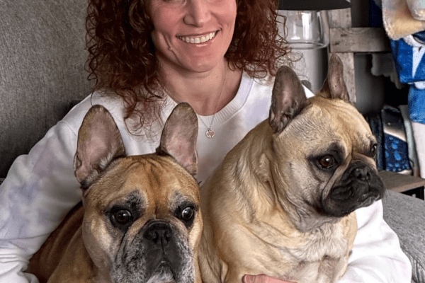
French Bulldog Village to Receive $250 Donation
Giving Back is Part of Our Culture At Vivid Image, we believe our success is tied to the well-being of our community and sometimes that community includes our four-legged friends! Each month, our team members have the opportunity to direct a $250 donation toward a nonprofit that holds personal significance to them. Karissa Champions Specialized Care for Frenchies This month, Karissa Continue Reading

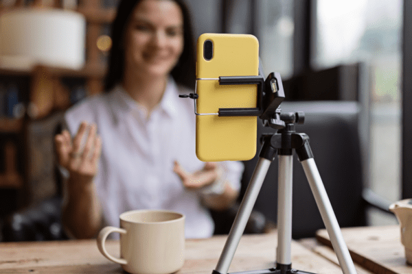
Where to Start with Short-Form Video
If you’ve spent any time online lately, you’ve probably noticed just how big short-form video has become in everyday marketing! It shows up when you’re scrolling Facebook, browsing Instagram, or watching quick tips on YouTube. At some point, most business owners have the same thought: we should probably be doing this too. Not because it’s trendy. Not because everyone else is doing it. But Continue Reading

The Pets of Vivid Image
We wanted to take a moment to introduce you to the pets of Vivid Image that bring excitement, enthusiasm, the occasional frustration, and continual laughter to our lives! Yoda & Wicket Yoda and Wicket are two French Bulldogs who have clearly mastered the Force… of relaxation. They're experts at finding the most comfortable spot on the couch and staying there for hours (unless a tasty Continue Reading
The Opportunity Your Short-Form Video Strategy Could Be Missing
Short-form video probably feels like something you know you should be doing. It’s everywhere. The platforms reward it. You’ve heard how important it is. Maybe you’ve even posted a few videos yourself. And yet, getting started, or getting it right, can still feel overwhelming, time-consuming, or unclear. Nearly every business knows they “should” be using short-form video, but while many are posting Continue Reading

Your Website Is Now AI’s Source Document (And That Changes Everything)
Wondering If Your Small Business Still Needs a Website In 2026? It's a fair question. Website traffic is down across the board. AI tools like ChatGPT and Google's AI Overviews are answering questions directly in search results. However, the importance of a website for AI cannot be overlooked when considering how your business is found and represented online. Why pay to maintain something fewer Continue Reading